This text is serving the dual purpose of being my last blog posting and my analysis for the class. Maybe in the next 8 hours a miracle of comprehension will occur and I will see significant results on the coding side. But first I have to complete the Reflective Essay.
Design and Production Analysis of Assignment Tracker iPhone Application
Assignment Tracker is the result of a class assignment. This application was designed to easily track classes, communicate with faculty, record assignments by due date, prompt the student about assignments prior to their due date and anticipate class grade based upon assignment scores. Future expansion options are numerous including push features from faculty, mapping functions, proximity awareness to other class members, course related cost calculations and project time analysis. The basic version developed during a summer class session is useful but significantly less than envisioned. Included in the following analysis are details about the original vision, suggestions and the forces that shaped the project.
Part 1 - Analysis
Introduction:
The concept of reading/writing for mobile devices is intriguing but simultaneously intimidating. As a writer, not a programmer, the task of designing and implementing an iPhone Application was a daunting undertaking. Constructing the application involved many steps prior to and in addition to the actual coding and compilation of the program. The four primary tasks were 1) analysis, 2) design, 3) production, and 4) evaluation.
These four tasks represent the organization of this analysis, with a fifth section, Resources included at the end. The first section chronicles the project; starting from a wide-open assignment description, essentially a blank slate, to selection of a grade tracking and assignment scheduling application. The next section describes designing the platform, the human interface, visualizing the displays, configuring data storage, and enabling calendar integration protocols. An overview of how I became familiar with iPhone programming techniques and standards and the actual coding of the application is discussed in the third section and the remainder of this report details the evaluation of the project including the requisite directions for sustaining and/or replication
Background:
Media is a very broad term in the twenty-first century. Technical communicators are expected to be familiar with all types of media. Many technical communications courses focus on the various types of print and a growing number consider web pages, blogs and other electronic media; but this is one of the very few classes primarily concerned with handheld and other mobile communication devices.
Early in the course we examined mobile applications that were useful, eye-catching, interesting, provocative, popular and otherwise note worthy. After looking at numerous applications consideration was given towards what characteristics constitute a great mobile application. Neal Goldstein writes in iPhone Application Development for Dummies (2009) “when it comes to creating a great iPhone application: Create a compelling user experience [and] Exploit the platform.” Goldstein elaborates, “A compelling user experience enables users to do what they need to do with a minimum of fuss and bother… meeting the expectations of the user based on the context … in which they are using the application.” Regarding exploiting the platform, Goldstein points out that “The iPhone has the capability to be an extension of the user, seamlessly integrated into his or her everyday life, and able to accomplish a singly focused task, or step in a series of tasks, in real time, based on where he or she is.”
The assignment was to “Complete a reading/writing for mobile devices project. Suggested options: an iPhone App, a page designed to be read on a mobile device, audio and/or video-rich page for class or work...” With the performance objective defined as “Manage projects through iterative design. Measurement: successful planning and development of a mobile device rhetoric project.”
Having just purchased an iPhone, I committed myself to an iPhone application before realizing the complexity of such a project. During one of the class sessions, it was pointed out that several very young students had successfully developed and marketed iPhone applications, including one nine year old who is fluent in many programming languages who has written several apps (http://news.zdnet.com/2100-9584_22-266264.html). This intensified my resolve to complete this project even though I had no modern programming experience.
In reality, one of the other options would have been a better fit for my skills, but education is intended to stretch the individual outside of the normal comfort zone, so the iPhone Application was an acceptable choice.
For several weeks, the class discussed options and ideas relating to potential projects. Elaborate, cutting edge projects that would revolutionize the way the world views mobile devices were out of the question. Simple, useful reading/writing projects were preferred. All the ideas I came up with were too grandiose to even diagram the workflow. I was urged to think simpler.
We were also encouraged to discuss ideas with potential end-users, do some informal needs assessment interviews or otherwise research the intended market. I conducted several discussions with disorganized students who always carried their phone, but no longer carried date books or planners. They were frequently conferring with each other to determine when upcoming assignments were due and the specific requirements associated with each project. This is how Assignment Tracker was born. It was school related, met a need, accomplished a single focused task in real time and would be readily accessible at any time.
Part 2 – Design
Having progressed from a blank slate to an idea I now struggled to codify this concept into a finished iPhone application in less than two months. The first step in the design procedure would normally be to ascertain the need and define specific desired outcomes. A needs assessment matrix but is defined below.
Needs Assessment Matrix
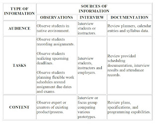
Since this was a shortened summer session, a single student interview, an inspection of printed assignment calendars at a local bookstore and a brief survey of available web based similar templates was conducted to determine need and basic document design.
After determining the need, the second design step was to identify the specific goal of this project. I knew it needed to be a mobile application, wanted some element of locality awareness, and needed to be easy to operate. Part of the class discussion had included intuitive operation successful applications by the web generation users.
Elements of the program that were defined at this early stage included:
• School and Semester Information
• Course Information
• Instructor Contact Information
• Class Meeting Information
• Assignment Information
• Assignment Progress and Resources
• Grade
Semester information was included to automatically set beginning and end class dates for the individual courses. But once it was included it became obvious that a method of archiving previous semesters and/or identifying the current active semester was required. Additionally, since some summer sessions are Summer I, others Summer II and others overlap both sessions, some flexibility needed to be incorporated in the design that allowed default date entry and individual customization.
Course information was standard in all the models examined and while my initial thought was all that was needed would be course number and description, allowing flexibility so that this application could be utilized by middle and high school students as well as college students required some additional fields and less reliance upon course number.
Instructor contact information was a simple and convenient way to exploit the mobile device’s unique capabilities. Being able to save this information to a contacts file with a one touch phone dialer or e-mailer was seen as desirable. Having a photo or website link was also beneficial.
Class meeting information was another broadly defined category. I wanted to be able to locate classroom and determine route to get there from current location, using either direct pedestrian or predefined bus route paths using the large Texas Tech University campus as my model. A student attending an institution with a non-contiguous campus would derive additional benefits from this mapping feature. Entering freshmen are frequently the least familiar with the layout of the campus and most likely to have classes in various buildings around the campus. Online classes may meet at a specific website or telephone number, so adaptability to handle more than a physical location was also required. Not only the access address, but also the password or conference number or connection instructions should be able to be saved in this field as well.
It was easily foreseeable to want to add classmate information, textbook, lab, or other related information to this )or a separate) field. Having a student advisor in the class, I was reminded of the fact that some classes are retaken or affect grade point average differently and these special factors would also be convenient to add into this area and one recommendation was to include a cost basis associated with the class, each of which are excellent points but deviate from Goldstein’s ideal of a single focused task.
Assignment information is the crux of the program and needed to be readily adaptable to a variety of uses. Reading assignments, graded assignments, participation requirements, quizzes, papers, projects and other potential assignments all needed to be considered in defining the parameters for this data element. Additionally, each assignment needed to correlate to either a course or semester. Questions immediately started surfacing about how to handle general calendar items like add/drop deadlines and Spring Break dates – whether they should be replicated automatically within each course or a single listing under semester, non-course specific entries. Would the student sort all assignments chronologically or view each course data individually? How would this data synchronize to an iCalender or Outlook calendar? Would this information be shareable between users, downloadable, application specific or otherwise exportable?
I also envisioned prompts, timelines, planning tools and notes within each assignment. Whether it was an automated email two hours before class reminding the student to remember to bring x to class or a weekly prompt to update status on a larger research project; I wanted the application to handle generation of numerous levels of easily programmable (and default) prompts. Grades are only one level of feedback, so I also wanted the system to be able to record simple or complex status categories of completed, blogged, discussed, submitted, or grade received. Sometimes the same broad assignment category has several components, consideration was given to whether each component should be a separate assignment (if so, then assignment needs to be replicable to facilitate multiple entries with minor changes) or be capable of subdivisions. A special category was also considered since the course I am currently taking had the requirement of “Tweeting” daily. How would this be tracked? Graphical chart of tweets including details as to number that included specific hashtags? Hyperlink to a feed that contains external data? Or just an “in progress” status designation that does not get bogged down in the details? Throughout this design process I was constantly striving to balance usability with the single focused task direction.
Assignment resources were also a concern. Links to references and works in progress should be available to exploit the iPhone’s ability to remotely connect to those links. But the vast variety of formats those links could reference could prove to be counterproductive to the application. Why spend time downloading a document you can’t view? What use is a website that is not optimized for mobile viewing? Are these essential or deviations from the single focused task?
The grade seems relatively straightforward, but my intention was to detail the weighted average for the course. Therefore, I wanted to be able to set each assignment up as a percentage of the final grade and upon the receipt of each grade, be able to enter that in the course grade computation matrix to compute minimum score required on remaining assignments to achieve specific course grade or anticipated grade based upon continued level of performance.
After listing these and other options, a priority list of essential characteristics was developed. At a minimum, the application would have a course description, and assignment description. Assignment status, due date and grade received would also be available. Anything further would be evaluated on a cost benefit basis but not considered necessary for this initial application.
As I approached the project estimation step I attempted to visualize the time requirements to learn enough Objective C programming language, construct the workflow, develop the displays and complete the application. Working with minimal information, I realized very quickly that the learning curve associated with programming a quality application before the end of the semester was going to be difficult. I will enumerate many of the steps taken in the production section, but some of the design and production steps overlap significantly and occurred concurrently. Also, please see the resources section for details on some of the books and links utilized in both designing and producing the project.
The next step in developing this application was defining the data fields and dependencies. I detailed this in my blog entry from July 19, 2009 (http://arthurpare.blogspot.com/2009/07/iphone-application-update.html). I constructed a simple Excel table listing all variables and data strings that I could foresee using in this application and listed the functions that would be executed upon each one. This helped me narrow down the list of functions required, the workflow organization and further define the scope of the project. The more standard format is to flowchart these dependencies, but I was not fully aware of that at the time. An additional feature of this spreadsheet (currently available at http://www.box.net/shared/static/oq7sanfh91.xls) is that the next six sheets (or tabs of the spreadsheet) represent different views referred to in the first page.
Now that I had a basic vision of how I wanted the final version interface to appear, I utilized the awesome power of OmniGraffel templates and built realistic looking screenshots of my anticipated iPhone application. See July 26th, 2009 blog entry (http://arthurpare.blogspot.com/2009/07/omnigraffel-application-images.html).
 The first image depicts a dial picker (UIPickerView). After this image was built, I decided that a more efficient method would be to build an array NSMutableArray *semester; and NSMutableArray *courses; which would create a split dial picker and allow the user to select the semester and course on a single view.
The second view showed detail concerning the course.

Ideally, when the instructor name was entered, it would search the contacts file and automatically insert the e-mail address and phone number. When the e-mail is selected it would open the default mail program and begin composing an e-mail message to the instructor. Selecting the phone would automatically dial that number.
The coding for this is relatively simple, inserting the string name where the phone number is in the following:
NS URL *url = [[NSURL alloc]
InitWithString: @”806-742-1234”];
[[UIApplication sharedApplication] openURL: url];
I found it interesting that a telephone number is treated as a URL by the iPhone and that if the URL began with tel: it launched the phone application. This is another instance of Apple simplifying code in iPhone development.
The third view was one of my favorites. When course location was selected, an image of the building would appear with building name and room number.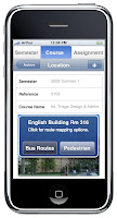
By selecting the image or building name the GPS was activated, pulled the coordinates for that classroom and asked whether you wanted to map your route via bus or as a pedestrian.
The pedestrian route would be simple enough to implement using the Application calls, but coding the bus routes would involve integration with external websites, directional information and time constraints and may be quite difficult to implement. More importantly, it would have to be configured separately for each institution. A generic ‘one-size fits all’ solution would not currently be possible.
I searched TTU’s Facility Planning and Construction website and did not find a link with the coordinates for each building on campus, but I have been told that it already exists and could be integrated into the application. Slightly more difficult would be finding and/or entering the coordinates for each room. I do not think the current GPS can differentiate elevations, so there may still be limitations to this functionality.
The next image shows the basic assignment and grade weights for a course.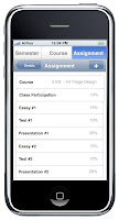
Initially, these weights will have to total 100%, but it is quite possible to compute based upon relative weights. This would be extremely helpful in a class where the final was optional or could be used to replace any other test score or where extra credit points are built into the grading system. Back to the issue of this being a focused application performing a single dedicated task, while these abilities may be helpful in specific situations, entering the initial grade matrix to take advantage of that processing capability might prove to be much more difficult for the user than the resulting benefit warrants.
InitWithString: @”806-742-1234”];
[[UIApplication sharedApplication] openURL: url];
I found it interesting that a telephone number is treated as a URL by the iPhone and that if the URL began with tel: it launched the phone application. This is another instance of Apple simplifying code in iPhone development.
The third view was one of my favorites. When course location was selected, an image of the building would appear with building name and room number.

By selecting the image or building name the GPS was activated, pulled the coordinates for that classroom and asked whether you wanted to map your route via bus or as a pedestrian.
The pedestrian route would be simple enough to implement using the Application calls, but coding the bus routes would involve integration with external websites, directional information and time constraints and may be quite difficult to implement. More importantly, it would have to be configured separately for each institution. A generic ‘one-size fits all’ solution would not currently be possible.
I searched TTU’s Facility Planning and Construction website and did not find a link with the coordinates for each building on campus, but I have been told that it already exists and could be integrated into the application. Slightly more difficult would be finding and/or entering the coordinates for each room. I do not think the current GPS can differentiate elevations, so there may still be limitations to this functionality.
The next image shows the basic assignment and grade weights for a course.

Initially, these weights will have to total 100%, but it is quite possible to compute based upon relative weights. This would be extremely helpful in a class where the final was optional or could be used to replace any other test score or where extra credit points are built into the grading system. Back to the issue of this being a focused application performing a single dedicated task, while these abilities may be helpful in specific situations, entering the initial grade matrix to take advantage of that processing capability might prove to be much more difficult for the user than the resulting benefit warrants.
 The last image represents a picker array being used to determine an assignment due date. One surprising characteristic of using these preordained protocols is that they are not very flexible in size. The picker selectors especially are very large and cumbersome. This picker did not include year. With course tied to semester, that may not be a significant issue, but whether year is selected or intuitively added to the record, it is necessary to integrate these assignments into an external calendar application like outlook or iCalendar.
Not only did these OmniGraffel images look realistic, they forced me to use standardized navigation controls in determining the data entry interface with my application. One of the innovative features of iPhone applications is that they are all built using standardized protocols so all apps have a certain familiarity and comfort level. The user is instantly comfortable with navigating the app and the developer can invoke prewritten and tested protocols utilizing an open library of features. Each book I used welcomed the readers to replicate and incorporate the code presented in their projects. The collaborative effect of all the developers working together makes iPhone application development possible even for those of us who are not trained as programmers.
Part 3 – Production
Following a period of analysis and design, armed with a complete list of strings, variables and function descriptions, register ranges and realistic target views of the planned project application, I started on the production in earnest.
Always seeking the shortcut, let me rephrase that, desiring to most efficiently allocate my rapidly diminishing available time before the project due date I examined every conceivable alternative. A promising opportunity presented itself when I found a functioning Mac program that essentially did everything I wanted. This program was open source collaborative software available from SourceForge (http://sourceforge.net/projects/assign-calc/). All I would need to do was optimize this program to display on an iPhone instead of a Mac computer screen.
I looked at the various releases, the notes, the code, the comments, and the bug reporters and was elated. This group had already worked through all the really difficult parts of this program (Note to self – they were programmers. It took them three years to make this level of progress). After two weeks of frustrating work with nothing positive to show for it, I decided that changing the syntax of a program written in Cocoa but using the AppKit.framework, WebKit.framework and Foundation.framework are similar enough to a project written in UIKit.framework and Foundation.framekit but without extensive knowledge of each function call they were beyond my expertise to reconcile. The AppKit.framework did not utilize a ViewController. I still believe that the NeXT Interface Builder files (NIBS) from that program should be able to convert to UIKit integration if I could find the elusive translational key. The structure is very similar and that is the single most important section. The Info.plist files also appeared to be very close, the Mac version had an entry for ‘Principal class’ and the iPhone version had a checkbox for ‘LSRequiresIPhoneOS,’ but the other ten elements were identical.
So I started with what knowledge I had gained (See Resources section), which included several tutorial projects that obtained similar results to what I wanted, but I could not start with an elaborate very similar program and just change the field labels (trust me, I tried, it does not work that way).
I followed the examples from the books I had purchased. Initial coding steps were very positive. I created a screen with course name and description that looked similar to my model. But the point is, I created a screen. This was not variable user entered text. Next step was creating a split field or table with description on one side and text on the other. I am finally beginning to understand @property and forKey: syntax.
The project at this point has not progressed much further. I can input Course information and the application holds it. It has identified the course as the key to affiliate assignment information and save accordingly. But the two screens do not communicate with each other properly yet.
Obviously, production has not yet been completed. The project is viable and I intend to continue working on it over the next few months. When it is no longer being considered for a grade, I will feel comfortable in seeking assistance from several skilled programmers I am acquainted with and utilize their expertise in completing this application. I will also be able to work through the books I have purchased at a leisurely rate, actually absorbing the information rather than rapidly scanning for pertinent clues.
Part 4 – Evaluation
As is, the application is not usable. Therefore, it cannot be evaluated for efficiency, simplicity, vulnerabilities, limitations or flexibility. In lieu of actual results, I am including parameters for measuring certain features to be utilized when the application is completed. None of the class readings detailed any definitive measurement criteria and a general online search did not reveal any specific context for evaluating an iPhone application.
A general sense of usability could be obtained by evaluating the following:
Administrative Elements – Is subscription required? Licensing? Is code original, Creative Commons, Public Domain, properly attributed?
Aesthetics – Logo selection, opening splash, default screen, colors, general layout. Is the overall affect effective? Is anything distracting? Are elements grouped into properly sized data screens or is there excessive scrolling required?
Architectural Support – Are activate, archive, cancel, configure, delete, edit, preferences, progress bars, rotation, save, undo, sort and other underlying features properly coded and appropriately accessible?
Customization/Integration – Is program compatible as advertised? i.e. in this case does it synchronize with Outlook and iCalendars? Can data be archieved and/or exported through CSV or other compatible format?
Dialogue Design – Are all human-phone and computer mediated communications appropriately designed. Consider elements such as information and visual perception, object recognition, object localization, perceiving motion, color perception, touch recognition, two finger, pinch and expansion touches, etc.
Disabilities – Is there anything that could be done to assist users with visual, auditory or tactile disabilities to assist in the operation of this application?
Help Files – If any assistance is needed, are their local or online help files readily accessible? Is help context sensitive or generically presented. Search, Index or plain text? Is there a ‘Report a bug’ or contact address?
Information Design – Are data entry screens and outputs embodied in a way that is appropriate for the target market? i.e. In this case is the format appropriate for high school students, college students and graduate students?
Information Perception – Is there anything that could be interpreted as discriminatory? Look for any implied bias, distracting elements, etc.
Information Processing – Are application results consistent with expectations? Any obvious errors in sort routines or presentation of data?
Interactive Elements – Are labels properly descriptive and field entry parameters flexible enough to meet most needs? Should some fields auto populate by default? Is text size legible, convenient, scalable? Are all necessary fields included? Are some fields superfluous? Is overall interface intuitive? Are all finger selectable items sized properly? (a minimum of 44x44 target is recommended for iPhones).
Learnability – Is application intuitive, standardized, and/or easily understood? Is any non-conventional nomenclature or interface utilized? Would additional instructions be beneficial or would a rework of the process be more advantageous?
Linked Elements – Do maps, contacts, help, bus routes, class schedules and locations and any other applicable data connect properly? If location or institution specific data needs to be configured is that interface intuitive or properly documented?
Operation – Are there memory leaks? Does program hang at certain transitions? Do data entry screens and called applications (keyboard, number pad, e-mail, telephone, browser, GPS) function as expected? Do they appear and disappear in a convenient manner. Do they obscure view of fields being input?
Orientation – Does screen automatically react to rotating the phone? Are screens identical or are they optimized for portrait and landscape views?
Personality – Considering the cognitive and perceptual abilities of all potential users, cultural backgrounds and traditions and potential differences in perspective, personality and preferences on the use of the application – (catch all category) is there any concern or suggestion for improvement?
Purpose – Does application meet single focused purpose definition? Are there too many options? Is it too difficult to use for benefit received? Is it enjoyable or beneficial? What motivates user to utilize application?
Search – After data is entered, is it obvious and convenient to search data by different criteria? (i.e. Date due, course, semester, and priority)
Static Elements – Are labels descriptive? Are navigation controls intuitive? Is application purpose obvious?
Part 5 – Resources
Goldstein, Neal. iPhone Application Development for Dummies. Hoboken, NJ, Wiley Publishing Inc., 2009.
Mark, Dave and LaMarche Jeff. Beginning iPhone Development, Exploring the iPhone SDK, A complete Course in iPhone and iPod touch Programming. New York, NY, apress, 2009.
Zdziarski, Jonathan. iPhone SDK Application Development (includes an Objective-C Mini-Primer). Sebastopol, CA, O’Reilly Media, Inc., 2009.
--- Personal Details about Resources Above ---
When I first enrolled at the iPhone Developer Center – Apple Development Connection (developer.apple.com/iphone/) I was impressed by the number of videos, help files, code libraries, tutorials and other resources. I thought that would be sufficient to complete the first release of the project.
After working several of the tutorials, I decided I needed a more tangible text based instruction method and spent some time at the local bookstore comparing the few titles available in this area. I purchased the O’Reilly Media book by Jonathan Zdziarski.
This is a great book, about 365 pages and I could absorb it fairly well in about a year’s time. First three chapters were fine and then the author kicks it into gear and assumes you understand the basics. The subtitle is “Building Applications for the AppStore,” which should have implied a higher level of intricacy to the programming language than I was ready for at this point.
Next, I ordered the apress book by Dave Mark and Jeff LaMarche from an online source. This 538 page book had wonderful examples and moved at a more understandable pace, until I hit chapter 7, Tab Views and Pickers. The next three chapters were entitled Introduction to Table Views, Navigation Controllers and Table Views, and Application Settings and User Defaults. If I had spent more time on those four chapters, I would have been better able to complete this project on schedule.
Third, I decided to purchase the For Dummies book by Neal Goldstein. I would highly recommend this as the first book for any non-programmer trying to understand iPhone SDK. I learned more through doing the exercises in the first three chapters than I had actually digested in the other two books.
One of the differences in the presentation that Goldstein makes is that he begins with a simple application, comparable to “Hello World” but continues to build on that same application throughout the first few chapters, which results in a viable application. Repetition of creating a new application every chapter may have its positive side, but I benefitted from seeing how the most basic application is enhanced and he guides you through logical steps like increasing font size, changing colors, changing row height, and speaks candidly about mistakes he made and encourages you to make a change, then tells you other ways to accomplish the same change. This book is much more verbose, 386 pages only covers what the initial five chapters of either other book covered, but for my money it was the better investment.
No comments:
Post a Comment